


1. Introduction
1.1 Material aesthetics, embodied experience, and urban cultural imagery
1.2 Research questions and hypotheses
2. Materials and Methods
2.1 Research design
2.2 Selection and pre-evaluation of cultural subjects
2.3 Cultural card design
2.4 Visual translation of cultural imagery
2.5 Paper samples
2.6 Testing of paper physical properties
2.7 Printing conditions and quality measurement
2.8 Participants
2.9 Experimental environment and procedure
2.10 Perceptual and aesthetic scales
2.11 Aesthetic–cultural semantic-differential scale
2.12 Data analysis
3. Results
3.1 Physical properties of the six paper stocks
3.2 Print quality across paper stocks
3.3 Sample characteristics and scale reliability and validity
3.4 Stage-related and paper–theme effects on aesthetic and cultural evaluation
3.5 Aesthetic–cultural semantic space of paper materials
3.6 Relationships among objective properties, sensory experience, and cultural cognition
3.7 Average structural relationships across paper–theme conditions
3.8 Paper-stock fit across the five cultural themes
4. Discussion
4.1 Paper as an aesthetic medium for urban cultural imagery
4.2 Dual criteria of technical reproduction and aesthetic expression
4.3 From physical parameters to a material aesthetic language
4.4 Bodily engagement and visual–tactile aesthetic experience
4.5 Material translation of five cultural images
4.6 From communication artifact to everyday aesthetic object
4.7 Theoretical contributions and design implications
4.8 Limitations and future directions
5. Conclusions
1. Introduction
Urban cultural communication combines digital and printed media, yet screens cannot reproduce paper’s weight, texture, temperature, stiffness, or reflectance. Paper-based media therefore act as multisensory interfaces rather than neutral carriers, because visual and tactile information jointly shape perception and overall evaluation. Since those evaluations depend on expectations and visual–tactile congruence, paper-based cultural media should be assessed through combined sensory experience rather than through screen mock-ups or isolated tactile descriptors [1,2].
These sensory effects have both measurable and aesthetic bases. Grammage, thickness, apparent density, roughness, whiteness, gloss, and opacity affect appearance, tactile feedback, and printability, but objective parameters do not map onto a single good–bad judgment. In cultural imagery, the same properties also operate as formal elements: whiteness and gloss can sharpen luminance and contour, whereas low whiteness, visible fibers, texture, and bulk can convey warmth, rusticity, temporal depth, surface rhythm, or volume. Paper selection therefore involves sensory, emotional, cultural, and meaning-related dimensions as well as technical requirements [3,4].
1.1 Material aesthetics, embodied experience, and urban cultural imagery
Dewey conceived art as an integrated experience arising from sustained interaction between the subject and the environment; aesthetic meaning is not sealed within an object in advance but emerges through the progressive integration of sensation, action, emotion, and meaning. This view explains the fundamental difference between a paper card and a screen image: viewers do not merely look but also pick up, rub, turn over, and sense the weight, temperature, and stiffness of the card. Changes in paper reflectance, resistance to fingertip movement, and the card’s sense of volume in the hand jointly constitute an aesthetic event. Somaesthetics further treats bodily awareness, motor experience, and sensory training as conditions of aesthetic perception, allowing touch to extend visually centered formal judgment [5,6].
At the experiential level, the aesthetic is not confined to institutionally recognized artworks. Everyday aesthetics brings the sensuous qualities of ordinary objects, materials, and environments into aesthetic inquiry, while design aesthetics holds that sensory pleasure arises from unity and variety in form, familiarity and novelty, and an appropriate degree of congruence across sensory channels. A cultural card may accordingly be understood as a small-scale art object that can be viewed, touched, carried, and collected. Its aesthetic object is not an isolated motif but an integrated chromatic–tactile whole constituted by graphics, typography, color, paper, and bodily action [7,8].
In this study, “cultural imagery” refers to an aesthetic representation formed through the formal distillation of local cultural features, affective associations, and collective memory. The folk rusticity and warmth of Huishan clay figurines, the interplay of solid and void and quiet elegance of Jichang Garden, the temporal accumulation and linear extension of the Grand Canal, the spacious clarity of Yuantouzhu, and the intricate craftsmanship of fine embroidery each call for distinct material luminosity, surface rhythm, and tactile qualities. When the sensuous qualities of paper extend the formal characteristics of the graphic design, viewers are more likely to experience aesthetic coherence and expressive force; when the material character conflicts with the cultural imagery, even accurate print reproduction may produce aesthetic estrangement. Material properties are therefore relational and processual, acquiring cultural significance only through specific practices of making, viewing, and touching [9].
Accordingly, this study defines aesthetic experience (AE) as viewers’ integrated evaluation of formal pleasure, material–image layering, multisensory coherence, and artistic expressiveness during viewing and touching. AE is situated between visual and tactile perception and judgments of cultural congruence: VP and TP address how the image and material are sensed, AE addresses whether those sensory factors form a coherent and expressive artistic experience, and CC addresses whether the paper–image combination is appropriate to a specific cultural theme. This construct separation accords with the experiential-aesthetics view that perceptual analysis, aesthetic integration, apprehension of meaning, and judgment constitute successive but distinguishable stages of processing [10].
Material characteristics also carry semantic meanings. An identical cultural graphic printed on high-gloss coated paper, low-whiteness recycled paper, or high-bulk art paper may activate different associations, such as “modern,” “traditional,” “natural,” “refined,” “rustic,” or “substantial.” When material semantics accord with the cultural theme, viewers are more likely to regard the medium’s expression as credible, regionally distinctive, and worth retaining. When they conflict, the cultural expression may appear commercialized or inauthentic even if the color reproduction is accurate. Crossmodal semantic congruence can therefore improve aesthetic experience and product evaluation [11].
In this study, cultural authenticity is a perceptual judgment that viewers form from media cues rather than a professional authentication of historical or intangible cultural heritage. Authenticity may be established by indexical cues such as an object’s origin, craftsmanship, and materials, or constructed through viewers’ interpretations of symbols and narratives. In cultural products, local identity, craftsmanship, materials, and cultural markers jointly inform authenticity judgments. Modern design does not necessarily diminish authenticity; the critical issue is how design cues are integrated with cultural content. The cultural role of paper is therefore better understood through material–content congruence than through the presumption that traditional materials are necessarily superior to modern ones [12,13].
Wuxi encompasses multiple categories of cultural resources, including traditional folklore, Jiangnan gardens, historic canal spaces, the natural landscape of Taihu Lake, and refined traditional crafts. These subjects differ markedly in their target semantics: Huishan clay figurines emphasize folklore, handcraft, and locality; Jichang Garden emphasizes natural order, subtlety, and classical aesthetics; the Wuxi section of the Grand Canal emphasizes historical continuity and spatial memory; Yuantouzhu emphasizes an expansive and luminous image of nature-based tourism; and Wuxi fine embroidery emphasizes delicacy, technical precision, and ornamental value. Wuxi cultural cards thus provide a suitable standardized medium for testing whether the same paper stock is appropriate for different cultural content and whether different paper stocks alter perceptions of the same cultural content.
Existing research has four principal limitations. First, studies of visual design for urban culture generally emphasize symbols, color, and layout while seldom treating paper as an independent variable. Second, paper and printing research often remains focused on engineering quality and has not fully explained how objective parameters are translated into cultural semantics. Third, although packaging-touch research demonstrates that materials influence judgments of quality or naturalness, cultural congruence, perceived cultural authenticity, and cultural recognition are rarely incorporated into a single model. Fourth, related empirical studies frequently substitute general evaluations such as “liking” or “perceived quality” for aesthetic mechanisms and fail to distinguish visual reproduction, tactile sensibility, aesthetic experience, and cultural judgment. This study therefore constructs a complete chain from objective materials and print reproduction to visual–tactile perception, aesthetic experience, and cultural cognition, while distinguishing “optimal technical reproduction” from “optimal aesthetic–cultural fit.”
1.2 Research questions and hypotheses
This study addresses five questions: (a) Do different paper stocks significantly influence visual and tactile perceptions of Wuxi cultural cards? (b) What relationships exist between paper surface properties and print quality? (c) How do visual and tactile perception jointly generate aesthetic experience? (d) Does aesthetic experience link sensory experience, cultural congruence, and perceived value? (e) Do the aesthetic images of the five Wuxi cultural themes exhibit different patterns of fit with paper stocks?
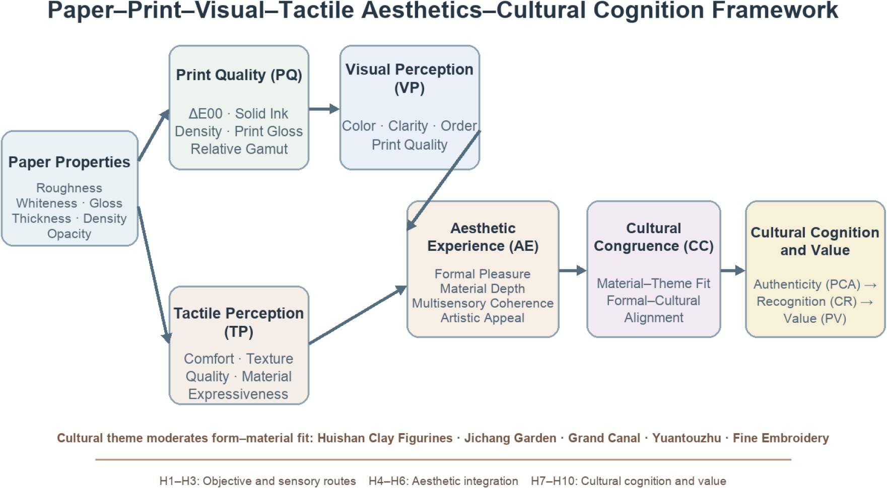
Drawing on theories of material characterization, multisensory congruence, experiential aesthetics, and perceived authenticity, the following hypotheses were proposed: H1, the Substrate Reproduction Composite (SRC) is positively associated with print quality; H2, the Surface–Bulk Composite (SBC) is positively associated with tactile perception; H3, print quality is positively associated with visual perception; H4, visual perception is positively associated with aesthetic experience; H5, tactile perception is positively associated with aesthetic experience; H6, aesthetic experience is positively associated with cultural congruence; H7, cultural congruence is positively associated with perceived cultural authenticity; H8, perceived cultural authenticity is positively associated with cultural recognition; H9, cultural recognition is positively associated with perceived value; and H10, aesthetic experience is positively associated with perceived value. Direct paths from visual and tactile perception to cultural congruence were included to test partial mediation by aesthetic experience. The structural paths were interpreted as average associations across the 30 paper × cultural-theme conditions, and the paper × cultural-theme interaction tested the conditional material-fit pattern. Fig. 1 summarizes the hypothesized relationships and the moderating role of cultural theme.
2. Materials and Methods
2.1 Research design
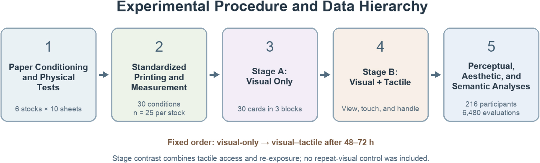
The study employed a 6 (paper stock: P1–P6) × 5 (cultural theme: C1–C5) × 2 (sensory stage: visual-only vs. visual–tactile) fully within-subjects design. The six paper stocks were fully crossed with the five cultural themes, yielding 30 experimental conditions. The study comprised seven sequential components: cultural-content selection, card-template design, testing of paper physical properties, standardized printing and measurement, visual-only evaluation, combined visual–tactile evaluation, and examination of structural relationships. Paper stock and cultural theme were modeled as fixed effects, and participants served as the repeated-measures unit.
The visual-only stage established a judgment baseline in the absence of direct tactile information; during the visual–tactile stage, participants could view, lightly touch, pick up, and turn over the cards. The two stages were separated by 48–72 hours and administered in a fixed order. In each stage, the 30 cards were divided into three blocks of 10 samples, with a 2-minute break between blocks. Visual perception, cultural congruence, and cultural recognition were measured in the visual-only stage, whereas all seven core constructs were measured in the combined stage. The fixed-order contrast captures the transition from initial viewing to later multisensory re-exposure; it combines added tactile access with familiarity because no repeat-visual control condition was included. Following the combined stage, semantic-differential ratings were administered separately using the six unprinted paper samples to minimize interference from cultural graphics with material semantics. Fig. 2 shows the experimental sequence and the resulting data hierarchy.
2.2 Selection and pre-evaluation of cultural subjects
Cultural subjects were selected across five dimensions: traditional folklore, garden culture, historic space, natural landscape, and traditional craft. The final set comprised Huishan clay figurines (C1), Jichang Garden (C2), the Wuxi section of the Grand Canal (C3), Yuantouzhu (C4), and Wuxi fine embroidery (C5). Eighteen experts participated in the pre-evaluation: 7 specialized in art studies, art history, or visual culture; 5 in visual communication or product design; 3 in Wuxi local-culture research; and 3 in printing and materials. Using seven-point scales, the experts evaluated each subject’s representativeness of Wuxi, clarity of aesthetic imagery, potential for formal translation, and semantic distinctiveness from the other themes. Mean representativeness scores for the five subjects ranged from 5.83 to 6.44, and mean clarity-of-aesthetic-imagery scores ranged from 5.72 to 6.31. The reported content validity index was the scale-level CVI using the average method (S-CVI/Ave). For each of the 20 subject-by-criterion items (five subjects × four criteria), the item-level CVI (I-CVI) was calculated as the proportion of the 18 experts assigning a rating of 6 or 7 on the seven-point scale; averaging the 20 I-CVIs yielded an S-CVI/Ave of .89. Expert ranking agreement was Kendall’s W = .71, χ2(4) = 51.12, p < .001.
The pre-evaluation also confirmed the target semantics: Huishan clay figurines were primarily associated with tradition, warmth, and rusticity; Jichang Garden with tradition, nature, and subtlety; the Grand Canal with history, substantiality, and cultural resonance; Yuantouzhu with nature, lightness, and luminosity; and fine embroidery with delicacy, refinement, and uniqueness. These target semantics were used to interpret paper-by-culture interactions rather than as prior scores for the formal dependent variables.
2.3 Cultural card design
All cards measured 105 mm × 70 mm and used the same information hierarchy, type system, graphic proportions, and negative-space structure. The front comprised a cultural graphic, city identifier, and experimental code. The theme name and an approximately 60-word cultural description appeared on the reverse and could be viewed only after the initial recognition judgment had been completed. Each of the five themes used a content-related dominant color palette, but the digital file for a given theme was identical across all six paper stocks. Files were prepared at 300 ppi, all text was proofread before conversion to outlines, and both trim size and corner radius were held constant.
No lamination, spot UV coating, foil stamping, embossing, or debossing was applied during postpress production. Standard color patches and control strips were placed outside the trim area and included paper white, CMYK solids, gray balance, and the five theme colors; these elements were removed after measurement and were therefore invisible to participants. The procedure yielded 30 experimental samples representing 5 cultural themes × 6 paper stocks. Eight rotating duplicate sets were produced for each condition to control for wear caused by repeated handling.
2.4 Visual translation of cultural imagery
While retaining a standardized layout and information hierarchy, representative aesthetic imagery was extracted from each of the five Wuxi cultural subjects and translated into controllable formal language. The translation followed the sequence “identification of cultural features–distillation of core imagery–organization of formal relationships–anticipation of material expression.” Huishan clay figurines used rounded contours, warm color relationships, and moderate exaggeration to express the vitality and rustic charm of folk art. Jichang Garden used alternating spatial density and openness, blue-green-gray tones, and negative space to express the interplay of solid and void and an understated elegance. The Grand Canal used horizontal extension, low-luminance blue-gray hues, and layered relationships to convey hydrological continuity, historical memory, and temporal depth. Yuantouzhu used an open composition, high-luminance blue-green hues, and expansive horizontal lines to evoke the clarity and brightness of the lake surface. Fine embroidery used high-density fine lines, localized layering, and restrained color to express artisanal order, elegance, and intricacy.
The material-aesthetic requirements were derived from these formal structures. Huishan clay figurines favored warm white, low gloss, and visible fibers to preserve a sense of handcrafted warmth. Jichang Garden called for a fine yet restrained texture that echoed the spatial rhythms of concealment and revelation and of density and openness. The Grand Canal called for high bulk, low reflectance, and a stable sense of volume to reinforce historical accumulation. Yuantouzhu called for high whiteness, smoothness, and a broad color gamut to support spaciousness and translucency. Fine embroidery called for delicate relief and high tactile distinctiveness, extending the visual rhythm of needle and thread into fingertip perception. This translation established aesthetic relationships to be tested rather than presupposing that any paper stock would necessarily be optimal. Table 1 summarizes the imagery, formal language, and material requirements of the five themes.
Table 1.
Aesthetic imagery, formal language, and material requirements of the five cultural themes
2.5 Paper samples
All six paper stocks had a nominal grammage of 250 g/m2 to minimize differences in weight and foreground differences in surface and bulk. P1 was double-coated paper, expected to exhibit high smoothness and high gloss; P2 was matte-coated paper, expected to be smooth and low-reflecting; P3 was high-whiteness uncoated paper, expected to provide a natural tactile quality and moderate roughness; P4 was recycled paper, expected to have low whiteness and a pronounced fibrous character; P5 was textured art paper, expected to exhibit high tactile distinctiveness; and P6 was high-bulk uncoated paper, expected to provide a pronounced sense of volume. All specimens were conditioned for 24 hours in a standard atmosphere of 23 ± 1°C and 50% ± 2% relative humidity, and all tests were conducted in the same environment [14].
2.6 Testing of paper physical properties
Ten independent specimens were randomly selected from each paper stock. Grammage was measured in accordance with ISO 536:2019 [15], and thickness and apparent density were measured in accordance with ISO 534:2011 [16]. Apparent density was calculated as ρ = G / T, where G was expressed in g/m2 and T in µm, yielding ρ in g/cm3. Surface roughness was measured using the Print-surf method and expressed in µm [17].
CIE whiteness was measured under C/2° indoor illumination conditions [18], 75° specular paper gloss was measured in accordance with ISO 8254-2:2016 [19], and opacity was measured using the diffuse reflectance method with paper backing [20]. Five measurements were taken on each specimen at locations free from edges and visible defects. The mean for each sheet was calculated first, after which the 10 specimens served as the statistical units. Instruments were calibrated daily using a standard white tile and working standards.
The C/2° measurement characterized the standardized whiteness of the unprinted substrate and was analytically distinct from the M1 measurements used for printed color patches. Because P3 had the highest CIE whiteness (95.4%), its unprinted paper white was additionally measured with 45°/0° geometry under M1 and M2 conditions. M1 retained the specified ultraviolet component, whereas M2 excluded UV. The M1–M2 shifts in L*, a*, and b* were used as optical indicators of UV-excited fluorescence and potential optical brightening agent activity.
To characterize the physical state of the samples handled by participants, thickness and surface roughness were remeasured for P5 and P6 after printing. Ten finished cards from each stock were conditioned for 24 hours under the same environment used for the pre-print tests. Thickness and Print-surf roughness were measured at five predefined printed locations with comparable image coverage on each card, avoiding edges and visible defects. The five readings were averaged to obtain one value per card. These post-print values were used in the analyses and interpretations linking the physical characteristics of P5 and P6 to tactile perception.
2.7 Printing conditions and quality measurement
All samples were output using the same four-color dry-toner electrophotographic digital press, the same batch of CMYK toner, the same PDF/X-4 file, and a fixed color-management workflow. Pigment-bearing thermoplastic toner particles were electrostatically transferred to the sheet and then fused by heat and pressure; no liquid inkjet ink was used. The device was linearized and status-calibrated before each print run. All files were converted to the same device CMYK condition, and no paper-specific color compensation was established. Paper loading order was rotated according to a Latin square across five independent print runs; measurement samples were collected only after the warm-up sheets had been discarded in each run. Mechanical settings related to paper feeding and thickness were adjusted and recorded in accordance with device specifications, while color enhancement and automatic image optimization were disabled.
The common device profile was retained so that image separation, tone curves, and numerical CMYK input remained identical across all six stocks. This condition measured the combined substrate–press response under one controlled production workflow rather than the maximum output attainable after optimizing each paper separately. Because the device used fused dry toner, the principal substrate-dependent mechanisms were toner-transfer uniformity, fusing contact, surface microtopography, and paper-white compression, not liquid-ink penetration. The rougher, lower-white recycled surface of P4 consequently produced larger colorimetric deviations and a smaller effective gamut under the common separation. A P4-specific ICC profile and tone-reproduction curve would reduce these deviations and narrow its difference from the coated stocks; base-paper color and surface texture would remain part of the reproduced appearance.
The fused toner formed a polymer-rich image layer over printed regions rather than penetrating the fiber network in the manner of an inkjet colorant. This layer could partially fill surface valleys, modify fingertip friction, and increase local print gloss, while the heat and nip pressure could compact and smooth the sheet. Tactile perception was therefore interpreted as a response to the finished paper–toner surface. The post-print thickness and roughness measurements described in Section 2.6 were used to characterize this finished state for P5 and P6.
Print quality was evaluated using four indicators: CIEDE2000 color difference (ΔE00), mean CMYK solid ink density, 60° print gloss, and relative color gamut. Colorimetric measurements used 45°/0° geometry, M1 measurement conditions with the specified UV component, D50 illumination, and the 2° standard observer; measurement and colorimetric calculations followed ISO 13655:2017 [21]. The L*, a*, and b* coordinates were calculated in the CIELAB color space [22], and ΔE00 was calculated using the CIEDE2000 formula [23,24]. Target color values were obtained from a fixed reference proof. Relative color gamut was expressed as a percentage of the reference output gamut, set at 100%, and calculated from the volume ratio of standard control-strip patches in CIELAB space.
Each paper condition comprised 5 cultural themes × 5 independent print runs, yielding 25 statistical samples. Multiple measurement points on each card were first averaged before between-paper comparisons were conducted. Accordingly, the print-results tables report n = 25 for each paper stock.
2.8 Participants
An a priori power analysis assuming a small effect, α = .05, power = .90, and a repeated-measures correlation of .50 indicated that 198 valid participants were required [25]. A total of 224 participants were recruited. Three who did not complete both stages, 2 who did not pass a brief color-vision screening, and 3 who selected the same response option for more than 90% of items while completing the task in less than one third of the sample median time were excluded, yielding a final valid sample of 216 participants.
Participants were 18–56 years old (M = 29.84, SD = 8.17) and all had normal or corrected-to-normal vision. The sample included 108 participants who were Wuxi natives or had lived in Wuxi continuously for at least five years and 108 participants from outside Wuxi; 82 had an educational background related to design, art, or printing. As expected, cultural familiarity differed between the two groups: local or long-term residents reported greater familiarity than nonlocal participants, t(214) = 12.91, p < .001, d = 1.76.
2.9 Experimental environment and procedure
The experiment was conducted in a standardized D50 environment conforming to conditions for viewing printed matter [26]. The viewing source retained the UV component specified for D50 evaluation, the tabletop was neutral gray, and horizontal illuminance was maintained at 2,000 ± 500 lx. Because lux quantifies photopic illuminance rather than UV irradiance, the M1–M2 paper-white comparison described in Section 2.6 was used to characterize the UV-responsive component of P3. Participants adapted to the environment for 3 minutes. Samples were presented using double-blind codes for paper stock and theme: neither the participants nor the experimenters administering the sessions knew which paper-stock or theme condition each code represented, and the code key was unavailable to the experimenters during data collection. The order of the 30 conditions was generated using a Williams balanced sequence and then randomized again within each participant. Usage was recorded for every duplicate set, and sets were rotated; a sample was replaced immediately if its surface became soiled or its edges deformed.
During the visual-only stage, cards were placed on an adjustable stand approximately 50 cm from the participant. The initial stand tilt was 30°, and participants could vary the tilt from 15° to 45° and rotate the stand by ±20° without touching the card. After selecting a clear viewing angle, participants viewed each card for 12 seconds and then rated visual perception, cultural congruence, and cultural recognition. During the combined stage, participants first viewed the card, then lightly touched its surface with their dominant hand, picked it up, and turned it over, for a total contact time of approximately 20 seconds. They then completed the visual perception, tactile perception, aesthetic experience, cultural congruence, perceived cultural authenticity, cultural recognition, and perceived value scales. In both stages, participants first completed theme recognition and only then viewed the theme name and description on the reverse before completing the remaining evaluations. The fixed order placed the visual-only session first and the visual–tactile session 48–72 hours later; accordingly, the stage factor was analyzed as a combined touch-and-re-exposure contrast rather than as a touch-only treatment effect.
The D50 luminaires were positioned outside the observer–sample mirror-reflection path, and the sample plane was checked before each session using the high- gloss P1 card. Before a rating began, participants adjusted the stand or, in the combined stage, the card until no veiling reflection crossed the main image area. The timed viewing interval began after this orientation was established. If a specular highlight entered the image during viewing, the participant repositioned the sample and reinspected the affected tonal region before recording VP. This procedure preserved surface gloss as a visible material cue while preventing glare from obscuring tonal detail or causing sustained visual discomfort.
The study adhered to the principles of informed consent, voluntary participation, and anonymity. Participants received task instructions before the experiment and could withdraw at any time. Data were stored under numerical identifiers and used solely for research analysis, and participants received equivalent compensation after completing both stages.
2.10 Perceptual and aesthetic scales
All seven constructs were measured on seven-point Likert scales, where 1 indicated “strongly disagree” and 7 indicated “strongly agree.” Visual perception (VP) comprised four items assessing natural color, graphic and textual clarity, formal coherence, and print quality. Tactile perception (TP) comprised four items assessing tactile comfort, salience of material characteristics, tactile quality, and material expressiveness. AE comprised three items assessing the overall pleasure of color, composition, and material; the layering jointly created by paper texture and imagery; and artistic expressiveness. The candidate item referring to “cultural ambience” was excluded from the revised AE score and structural model because its semantic focus concerned cultural-theme interpretation, which was assessed directly by Cultural Congruence (CC). CC comprised three items assessing congruence between the paper and the cultural subject, the material’s support for the theme, and coordination of the paper with the graphics and colors. Perceived cultural authenticity (PCA) comprised three items assessing the authenticity of the cultural character, whether the material preserved rather than diminished authenticity, and the clarity of local cultural features. Cultural recognition (CR) comprised three items assessing the clarity of cultural type, the salience of Wuxi’s regional characteristics, and the joint enhancement of recognition by material and visual design. Perceived value (PV) comprised three items assessing willingness to retain the card, collectible value, and interest in learning more.
VP, TP, and AE corresponded respectively to formal manifestation, embodied sensibility, and aesthetic integration. VP concerned overall color, clarity, and formal order; TP concerned tactile comfort, texture, and material expression; and the revised three-item AE construct concerned general aesthetic pleasure, material–image layering, and artistic expressiveness. CC separately assessed the perceived fit of the paper–image combination to specific cultural content. This operational distinction prevents theme-related wording from appearing in both the predictor and outcome constructs.
Item wording was refined after a pilot test with 30 participants, whose data were excluded from the formal analysis. Composite scores in the main study were calculated as the mean of the items for each construct. Cultural authenticity consistently denoted participants’ perceived authenticity of the mediated expression and did not replace judgments of authenticity grounded in historical, craft, or heritage certification [12].
2.11 Aesthetic–cultural semantic-differential scale
Material semantics were evaluated using eight seven-point bipolar adjective pairs: modern–traditional, artificial–natural, rough–delicate, inexpensive–premium, cold–warm, light–substantial, commercialized–culturally grounded, and ordinary–distinctive. These terms described both materials and the aesthetic qualities that paper assumes when incorporated into artistic expression. Scoring was oriented so that higher scores indicated traditional, natural, delicate, premium, warm, substantial, culturally grounded, and distinctive qualities. Participants evaluated six unprinted and unbranded paper samples presented in randomized order. Parallel analysis was used to determine the number of components in the principal component analysis, and Varimax rotation was used to identify the material-aesthetic semantic space.
2.12 Data analysis
Means and standard deviations were first reported for paper physical properties and print quality, followed by one-way analyses of variance and Tukey post hoc comparisons to test differences among paper stocks. The reliability and validity of the perceptual and aesthetic scales were evaluated using Cronbach’s α, composite reliability, average variance extracted (AVE), and confirmatory factor analysis [27,28]. Discriminant validity was assessed using both the Fornell–Larcker criterion and the heterotrait–monotrait ratio (HTMT) [29]. Model fit was jointly evaluated using χ2, CFI, TLI, RMSEA with its 90% confidence interval, and SRMR[30].
Subjective ratings were analyzed using a sensory stage × paper stock × cultural theme repeated-measures analysis of variance. Greenhouse–Geisser corrections were applied when the assumption of sphericity was violated; post hoc comparisons used Holm or Bonferroni corrections, and partial η2 was reported. Correlation analyses used the means of the 30 paper stock × cultural theme conditions as the unit of analysis to avoid treating repeated ratings from the same participant as independent observations. Hierarchical regression first entered roughness, paper gloss, whiteness, thickness, and ΔE00, followed by VP and TP, to test whether sensory evaluations absorbed the variance in cultural congruence explained by objective parameters.
A two-level structural equation model was estimated with 6,480 sample evaluations at Level 1 and 216 participants at Level 2, using robust maximum likelihood estimation with participant-clustered standard errors. Before aggregation, each component property was direction-coded and z-standardized across the tested papers. The SRC was calculated as the equal-weight mean of reverse-coded standardized roughness, standardized whiteness, and standardized paper gloss. The SBC was calculated as the equal-weight mean of standardized roughness, standardized thickness, and reverse-coded standardized paper gloss. For P5 and P6, post-print thickness and roughness were used; for the other stocks, the measured substrate values were used. Print quality was jointly represented by reverse-coded ΔE00, solid ink density, and relative color gamut. Confidence intervals for indirect effects were derived from 5,000 bootstrap samples. All tests were two-tailed, with the significance level set at .05.
SRC and SBC were specified as descriptive engineering summaries rather than psychophysical or latent perceptual scales. Equal weighting provided a transparent reduction of correlated material variables and did not assume that tactile response changes linearly with each raw parameter. Their relationships with print quality and tactile perception were estimated empirically over the material range represented by the six papers. Coefficient of friction and surface energy were not included in the present measurements; these variables are required for a direct model of finger–surface interaction.
3. Results
3.1 Physical properties of the six paper stocks
The grammage of the six paper stocks was controlled within a range of 249.3–251.2 g/m2, and the main effect of paper stock was nonsignificant, F(5, 54) = 1.36, p = .254, η2 = .112. All other measures differed significantly across paper stocks: the main effects of paper stock on thickness, apparent density, roughness, whiteness, paper surface gloss, and opacity were all significant at p < .001. P1 was the thinnest, had the highest apparent density, and exhibited the smoothest and glossiest surface; P4 had the lowest whiteness; P5 displayed the most pronounced surface texture; and P6 was the thickest and had the lowest apparent density, indicating the strongest high-bulk characteristics. Detailed results are presented in Table 2.
Table 2.
Physical properties of six paper stocks and post-print verification of P5 and P6 (M ± SD)
Note. n = 10 for each pre-print and post-print condition. Rows without a qualifier report pre-print substrate properties; rows labeled post-print report measurements of the finished cards after printing and 24-hour conditioning. Em dashes indicate properties that were not remeasured after printing. P1 = double-coated paper; P2 = matte-coated paper; P3 = high-whiteness uncoated paper; P4 = recycled paper; P5 = textured art paper; P6 = high-bulk uncoated paper.
Post-print measurements characterized the physical state of the finished P5 and P6 cards. For P5, thickness decreased from 391.2 ± 5.3 µm before printing to 373.6 ± 5.0 µm after printing, while surface roughness decreased from 8.61 ± .42 µm to 7.75 ± .38 µm. For P6, thickness decreased from 456.5 ± 5.7 µm to 436.4 ± 5.5 µm, and surface roughness decreased from 4.31 ± .27 µm to 3.84 ± .24 µm. These values represent reductions of 4.5% and 4.4% in thickness and 10.0% and 10.9% in roughness for P5 and P6, respectively. In the finished cards, P5 retained a more pronounced surface texture and P6 retained the greater caliper. The pre-print and post-print measurements are reported in Table 2.
The auxiliary paper-white measurements also showed a UV-dependent shift for P3. Under M1, the paper-white coordinates were L* = 96.0, a* = .20, and b* = -4.40; under M2, they were L* = 95.2, a* = .18, and b* = -1.60, producing Δb* = -2.80. The more negative b* value under M1 indicates a stronger blue-white response when UV was present and is consistent with OBA-related fluorescence. This optical response complements the C/2° CIE whiteness value of 95.4% reported for P3 in Table 2.
3.2 Print quality across paper stocks
Paper stock significantly affected all four print measures. The main effect of paper stock was F(5, 144) = 134.05, p < .001, η2 = .823 for ΔE00; F(5, 144) = 78.32, p < .001, η2 = .731 for mean CMYK solid ink density; F(5, 144) = 586.80, p < .001, η2 = .953 for 60° print gloss; and F(5, 144) = 185.58, p < .001, η2 = .866 for relative color gamut.
P1 and P2 produced the lowest overall color differences, and Tukey comparisons indicated no significant difference between them; they were followed, in order, by P3, P6, P5, and P4. Relative color gamut exhibited the reverse pattern: P1 and P2 approached or exceeded the reference gamut, whereas P4 reached only 83.8%. P1 also yielded the highest solid ink density and print gloss. On the basis of these objective technical measures, P1 and P2 were identified as the two conditions with the best overall color reproduction; however, this ranking did not correspond to the subsequent cultural-congruence ranking. The corresponding print-quality statistics are summarized in Table 3.
Table 3.
Print quality across paper-stock conditions (M ± SD)
Note. n = 25 for each paper stock. Lower ΔE00 values indicate smaller overall color deviations; relative color gamut was calculated against a fixed reference output set at 100%. All values reflect the common device-profile workflow and do not represent the maximum output after paper-specific ICC optimization.
The technical ranking in Table 3 is specific to the controlled common-profile workflow. P4’s ΔE00 of 4.19 ± .52 and relative gamut of 83.8 ± 3.0% describe its reproduction with the same device separation used for the coated stocks. On the dry-toner system, P4’s rougher surface and lower paper white reduced toner-transfer uniformity and colorimetric contrast, increasing ΔE00 and compressing the measured gamut. These values represent common-profile output rather than P4’s paper-specific ICC-optimized capability; stock-specific profiling would move its output closer to the reference and reduce the observed gap.
3.3 Sample characteristics and scale reliability and validity
The valid sample comprised 119 women (55.1%), 95 men (44.0%), and 2 participants who selected another category or did not report their gender (0.9%). In total, 71.3% of participants were younger than 35 years, and 83.3% held at least a bachelor’s degree. The sample was balanced with respect to Wuxi residency background, and 38.0% of participants had a design-related background. Table 4 provides the full demographic distribution.
Table 4.
Participant demographic characteristics (N = 216)
Across the seven constructs, Cronbach’s α ranged from .88 to .92, composite reliability ranged from .89 to .93, AVE ranged from .73 to .79, and standardized factor loadings ranged from .82 to .91, indicating good internal consistency and convergent validity. For the revised three-item aesthetic-experience scale, α = .89, composite reliability = .91, AVE = .77, and the factor loadings ranged from .85 to .90. The data were suitable for factor analysis, KMO = .934, Bartlett’s test of sphericity χ2(253) = 3,658.42, p < .001. The revised seven-factor measurement model demonstrated good fit, χ2(209) = 319.77, p < .001, χ2/df = 1.53, CFI = .974, TLI = .968, RMSEA = .049, 90% CI [.039, .058], SRMR = .038.
The square roots of the AVEs ranged from .85 to .89 and all exceeded the highest interconstruct correlation (.79). The AE–CC HTMT ratio was .74, and HTMT values between AE and the other constructs ranged from .66 to .78. An alternative six-factor model that merged AE and CC fit less well, χ2(215) = 502.18, CFI = .927, TLI = .913, RMSEA = .086, SRMR = .071; relative to the revised seven-factor model, Δχ2(6) = 182.41, p < .001. The single-factor common-method model also fit the data poorly, χ2(230) = 1,459.26, CFI = .663, RMSEA = .157, SRMR = .129. These results supported the empirical separation of general aesthetic experience from paper–theme congruence. Reliability and convergent-validity statistics are reported in Table 5.
Table 5.
Reliability and convergent validity of the perceptual and aesthetic scales
3.4 Stage-related and paper–theme effects on aesthetic and cultural evaluation
Cultural-congruence scores were higher in the second, visual–tactile stage than in the initial visual-only stage. Overall CC was 5.34 (SD = .57) in the visual-only stage and 5.64 (SD = .55) in the visual–tactile stage, yielding a significant main effect of stage, F(1, 215) = 86.42, p < .001, ηp2 = .287. The stage × paper-stock interaction was significant, F(3.82, 821.30) = 31.67, p < .001, ηp2 = .128, as was the stage × cultural-theme interaction, F(3.39, 728.85) = 7.94, p < .001, ηp2 = .036. The three-way interaction was also significant, F(14.31, 3076.65) = 4.18, p < .001, ηp2 = .019. Because tactile access and repeated exposure occurred together, these values are interpreted as stage-related differences rather than touch-only effects.
The stage-related increments in CC were .07 for P1, .21 for P2, .32 for P3, .39 for P4, .48 for P5, and .35 for P6; the change was significant for all six paper stocks (p ≤ .002). P5 showed the largest visual–tactile-stage difference, d = .74, whereas P1 showed the smallest, d = .16. The paper-dependent pattern is consistent with a contribution from distinctive texture and bulk during handling, while the fixed-order comparison does not partition that contribution from familiarity.
During the combined stage, paper stock, cultural theme, and their interaction significantly affected VP, TP, AE, CC, PCA, CR, and PV, all p < .001. For the revised three-item AE measure, the main effect of paper stock was F(3.74, 804.10) = 65.42, ηp2 = .233; the main effect of cultural theme was F(3.42, 735.30) = 21.08, ηp2 = .089; and the paper-stock × cultural-theme interaction was F(14.18, 3048.70) = 15.71, ηp2 = .068. The largest paper-stock main effect was observed for TP (ηp2 = .310), the largest cultural-theme main effect for CR (ηp2 = .120), and the largest paper-stock × cultural-theme interaction for TP (ηp2 = .080). Complete test results are presented in Table 6.
Table 6.
Effects of paper stock, cultural theme, and their interaction on visual–tactile aesthetics and cultural cognition
The estimated marginal means for paper stock revealed a divergence between technical quality and aesthetic outcomes. P1 and P2 yielded the highest VP scores (5.91 and 5.86, respectively). Revised three-item AE scores for P1 through P6 were 5.68, 5.64, 5.57, 5.36, 5.99, and 5.75, respectively; P5 scored significantly higher than the other paper stocks, whereas P1 and P2 did not differ significantly. P5 also produced the highest TP, CC, PCA, CR, and PV scores (6.08, 5.85, 5.82, 5.78, and 5.98, respectively). Although P4 had the lowest overall AE, it reached 6.02 for the Huishan clay figurine theme, indicating that the aesthetic value of a material arises from the specific relationship between paper and cultural imagery rather than from a fixed hierarchy of roughness, low whiteness, or high gloss.
3.5 Aesthetic–cultural semantic space of paper materials
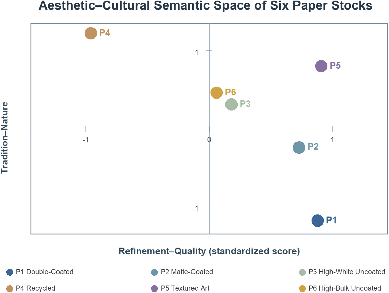
The semantic-differential data were suitable for principal component analysis, KMO = .842, Bartlett’s test of sphericity χ2(28) = 1,864.27, p < .001. Parallel analysis retained three components, which together explained 80.9% of the variance. Component 1 explained 38.6%; traditional, natural, warm, and culturally expressive had loadings of .87, .84, .76, and .73, respectively, and the component was labeled “Tradition–Nature.” Component 2 explained 27.2%; refined, premium, and distinctive had loadings of .86, .84, and .72, respectively, and the component was labeled “Refinement–Quality.” Component 3 explained 15.1%; substantial had a loading of .91, and the component was labeled “Heft–Volume.” Cronbach’s α values for the first two multi-item components were .86 and .83, respectively.
The six paper stocks occupied clearly differentiated positions in the semantic space. P1 fell within the “Modern–Refined” quadrant, whereas P2 leaned toward refinement but remained semantically more neutral. P4 had the highest Tradition–Nature score and the lowest Refinement–Quality score. P5 scored relatively high on both Tradition–Nature and Refinement–Quality, representing the coexistence of “handcrafted texture and a sense of quality.” P6 was most prominent on the Heft–Volume dimension. This structure provided a semantic explanation for the conditional matching of paper stocks to cultural themes. Fig. 3 visualizes these positions on the first two semantic dimensions.
3.6 Relationships among objective properties, sensory experience, and cultural cognition
Condition-level correlation analysis showed that roughness was positively correlated with Tradition–Nature semantics (r = .62) and TP (r = .55), whereas whiteness was negatively correlated with Tradition–Nature semantics (r = -.58). Unprinted paper surface gloss was positively correlated with Refinement–Quality (r = .49), and thickness was positively correlated with Heft–Volume (r = .64). Among print-quality measures, print gloss and relative color gamut were both positively correlated with VP, whereas ΔE00 was negatively correlated with VP (r = -.67). The psychological constructs formed a sequential pattern: VP and TP were each correlated with CC, and strong positive correlations were observed between CC and PCA, PCA and CR, and CR and PV. See Table 7 for details.
Table 7.
Condition-level correlations among objective properties, aesthetic semantics, and psychological constructs
The revised three-item AE measure was associated simultaneously with formal, embodied, and cultural judgments: its condition-level correlations with VP, TP, CC, PCA, and PV were .73, .71, .72, .68, and .75, respectively, all p < .001. AE was also significantly correlated with the Refinement–Quality aesthetic-semantic dimension (r = .68, p < .001). Objective properties therefore did not constitute aesthetic appeal directly; rather, they were transformed into aesthetic experience through visual luminosity, tactile texture, formal coherence, and material–image integration.
A hierarchical regression with CC as the dependent variable showed that the objective-property model explained 46% of the variance, F(5, 24) = 4.12, p = .008. Roughness, print gloss, and thickness were positive predictors; ΔE00 was a negative predictor; and the independent effect of whiteness was nonsignificant. After VP and TP were added, total explained variance increased to 74%, ΔR2 = .28, ΔF(2, 22) = 11.85, p < .001. Both VP (β = .37) and TP (β = .41) were significant, whereas the independent coefficients of the objective parameters were no longer significant. These results indicated that objective material and print information was associated with judgments of cultural congruence primarily through the visual and tactile experiences formed by the audience. The regression coefficients for both models are given in Table 8.
Table 8.
Hierarchical regression results predicting cultural congruence
3.7 Average structural relationships across paper–theme conditions
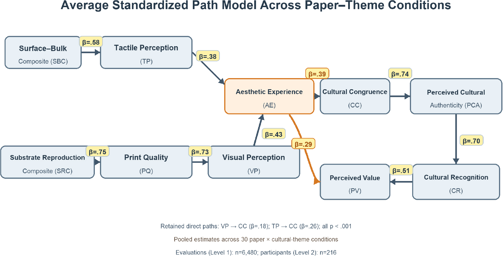
The two-level structural model estimated average relationships across the 30 paper × cultural-theme conditions and demonstrated good fit, χ2(216) = 330.84, p < .001, χ2/ df = 1.53, CFI = .974, TLI = .968, RMSEA = .049, 90% CI [.039, .058], SRMR = .039. The SRC significantly predicted print quality (β = .75), the SBC significantly predicted TP (β = .58), and print quality significantly predicted VP (β = .73). VP and TP positively predicted the revised three-item AE construct (β = .43 and .38, respectively), and AE positively predicted CC (β = .39). After AE was included, the direct paths from VP and TP to CC remained significant (β = .18 and .26, respectively), indicating partial mediation by AE. CC positively predicted PCA (β = .74), PCA positively predicted CR (β = .70), and CR positively predicted PV (β = .51); AE also directly predicted PV (β = .29). All 10 hypothesized paths and the two retained direct paths reached p < .001. These pooled coefficients describe overall tendencies and do not impose a common preference ranking within every cultural theme.
The model explained 56%, 34%, 53%, 48%, 57%, 55%, 49%, and 54% of the variance in print quality, TP, VP, AE, CC, PCA, CR, and PV, respectively. Bootstrap results showed that the indirect effect of VP on CC through AE was β = .17, 95% CI [.12, .23]; the indirect effect of TP on CC through AE was β = .15, 95% CI [.10, .21]; the indirect effect of AE on PCA through CC was β = .29, 95% CI [.22, .37]; and the serial indirect effect of AE on PV through CC, PCA, and CR was β = .10, 95% CI [.07, .14]. The total effect of AE on PV was β = .39, 95% CI [.31, .47]. The average path estimates are reported in Table 9 and Fig. 4.
Table 9.
Average standardized path estimates and explained variance for the two-level structural model
Note. A total of 6,480 evaluations were nested within 216 participants. AE = aesthetic experience; SRC = substrate reproduction composite; SBC = surface–bulk composite; “Direct” denotes a direct path retained to test partial mediation. SRC and SBC are equal-weight composites of direction-coded, z-standardized engineering measurements; they summarize the tested substrates and are not interpreted as psychophysical scales. The model used robust maximum likelihood estimation with standard errors corrected for clustering by participant. Coefficients are average associations across paper–theme conditions. R2 is reported once for each endogenous construct and spans all structural paths predicting that construct.
A moderated extension incorporating paper-stock × cultural-theme terms showed significant condition-specific variation, Δχ2(20) = 52.64, p < .001. Adding these terms increased the explained variance in AE from .48 to .60 and in CC from .57 to .72. Thus, the average positive print-quality → VP and VP → AE pathways coexisted with theme-dependent shifts in aesthetic and cultural evaluation. P1 retained an overall technical-reproduction advantage, while the P4–Huishan condition achieved higher conditional AE and CC because its material character aligned more closely with that theme.
3.8 Paper-stock fit across the five cultural themes
The interaction analysis adds a conditional level to the pooled structural model: the SEM identifies the average sensory pathway across all conditions, whereas the paper × cultural-theme analysis shows how material fit changes the magnitude and ranking of aesthetic responses. The matching matrix showed that the highest CC ratings for different themes did not converge on a single paper stock. Huishan clay figurines received the highest rating on P4 recycled paper (M = 6.12, SD = .58); Jichang Garden on P5 textured art paper (M = 6.08, SD = .59); the Grand Canal on P6 high-bulk uncoated paper (M = 6.02, SD = .60), although its difference from P4 was nonsignificant; Yuantouzhu on P1 double-coated paper (M = 5.96, SD = .61); and Wuxi fine embroidery on P5 (M = 6.19, SD = .55). Within each cultural theme, the simple effect of paper stock was significant at p < .001. Table 10 reports the cell means and standard deviations, and Fig. 5 visualizes the theme-specific pattern.
Table 10.
Cultural theme–paper material matching matrix: Cultural congruence M (SD)
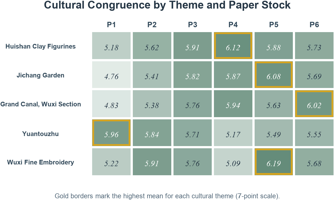
Relative to the second-highest-rated condition for each theme, the advantages of the optimal paper stocks for Huishan clay figurines, Jichang Garden, Yuantouzhu, and Wuxi fine embroidery were .21, .21, .12, and .28, respectively; all remained significant after correction. P6 and P4 differed by .08 for the Grand Canal, p = .184, and were therefore treated as co-optimal choices. When cultural familiarity was entered as a covariate, it was positively associated with CR (b = .16, SE = .03, p < .001), but the ordering of culture–paper preferences remained unchanged. Neither residency background nor design background significantly altered the principal interaction pattern.
The condition-specific peaks in the revised three-item AE measure corresponded to the optimal CC pairings: Huishan clay figurines–P4 = 6.02, Jichang Garden–P5 = 6.17, Grand Canal–P6 = 6.06, Yuantouzhu–P1 = 6.03, and Wuxi fine embroidery–P5 = 6.15. Although P4 had the lowest overall AE, it achieved the highest AE for Huishan clay figurines, further demonstrating that aesthetic judgment is not a ranking of material grade but a relational assessment among form, materiality, and cultural imagery.
4. Discussion
4.1 Paper as an aesthetic medium for urban cultural imagery
With the visual files, layout, equipment, and color-management workflow held constant, this study found that paper stock significantly altered print quality, sensory experience, aesthetic experience, and cultural cognition. Main effects of paper emerged not only for VP and TP but also for AE, CC, PCA, CR, and PV; more importantly, paper interacted with cultural theme across all seven constructs. These findings indicate that the meaning of a cultural card is not determined solely by its pictorial symbols. Material reflectance, texture, whiteness, and perceived volume constitute the work’s material form and inform viewers’ holistic judgments of whether it affords a coherent aesthetic experience and whether it feels true to the culture represented. The corresponding omnibus effects are reported in Table 6.
These findings echo evidence that haptic cues can transfer to product judgments [31] and extend the hierarchical model linking objective properties to affective evaluation in packaging-materials research [3]. From the perspective of material mediation, the aesthetic value of paper is not equivalent to material grade; rather, it resides in a relational quality co-produced by physical properties, making, visual form, bodily contact, and cultural context [4,9]. Urban cultural communication design should therefore treat paper as part of the system of artistic expression, rather than as a production decision deferred until after the visual design has been finalized.
4.2 Dual criteria of technical reproduction and aesthetic expression
P1 and P2 performed best in terms of ΔE00, color gamut, density, and VP, yet they did not achieve the highest CC for most traditional cultural themes. P4 had the largest color difference, the smallest gamut, and the lowest VP, but it was the optimal paper for Huishan clay figurines and, together with P6, one of the preferred papers for the Grand Canal theme. P5 delivered an intermediate level of overall color reproduction, yet achieved the highest overall CC, PCA, and PV and ranked first for Jichang Garden and fine embroidery. The positive print-quality → VP → AE pathway in Fig. 4 therefore represents an average sensory relationship, while the theme-specific rankings in Table 10 and Fig. 5 represent conditional material–cultural fit.
The print-quality order also reflects the fixed color-management condition. Holding one device profile constant exposed how each substrate interacted with the same CMYK separation, while paper-specific ICC profiles would have compensated part of the tone and chroma loss on P4. The ΔE00 and gamut values are therefore comparative measures of common-profile reproduction, not ceilings on the achievable quality of the uncoated and recycled stocks. The VP and cultural-fit ratings correspond to these same physical common-profile stimuli.
P1’s 62.5 GU print gloss also required control of the observation geometry. Participants could change the stand or card orientation before scoring, and any specular highlight crossing the main image was removed from the viewing path before the timed inspection. The procedure preserved gloss as a visible quality cue while preventing a localized reflection from hiding tonal detail or dominating VP.
Technical reproduction quality functioned as an average contributor to visual perception rather than as a universal ordering principle for aesthetic value. Theme-specific material congruence could strengthen or offset this pathway, explaining why P1 was not preferred in every context and why P4 generated stronger AE and CC responses for selected themes. A smaller color difference is useful for determining whether technical reproduction approximates the target, while material–theme fit determines whether that reproduction supports a cultural character and its aesthetic imagery. Processing fluency can explain why clarity, contrast, and familiar forms yield visual comfort [32], but aesthetic value is not simply the maximization of fluency. Glossy, smooth surfaces may enhance clarity, vividness, and a sense of modern quality, whereas low gloss, visible fibers, or texture may provide expressive tension that supports traditional, natural, and handcrafted meanings. Marckhgott and Kamleitner [33] found that matte surfaces can heighten perceived naturalness. The present study further shows that the value of this material meaning varies with cultural content: the same low-gloss, rough paper may appear congruent with traditional folk culture and historical space, yet diminish a sense of clarity and translucence in a bright natural-landscape theme.
P3 requires additional optical interpretation because its high CIE whiteness was accompanied by a marked M1–M2 blue-shift. Under the UV-containing D50 viewing source, OBA fluorescence could increase apparent brightness and produce a cooler blue-white appearance. At 2,000 ± 500 lx, this contribution was visually available during evaluation and may have supported the natural-color, graphic-clarity, and print-quality components of VP. Illuminance alone does not specify the magnitude of UV excitation; the measured M1–M2 shift provides the relevant optical evidence. P3’s VP score is therefore interpreted as a response to the combined effects of base-paper reflectance, UV-excited fluorescence, and printed color reproduction under the stated D50 condition.
4.3 From physical parameters to a material aesthetic language
Roughness correlated positively with traditional–natural meanings and TP, whiteness correlated negatively with traditional–natural meanings, and thickness correlated positively with heft–volume, indicating that engineering parameters can be mapped in part onto participants’ semantic judgments. This mapping, however, is not a simple linear valuation. The greater roughness of P4 did not reduce overall tactile evaluations, while P5 combined pronounced texture with relatively high ratings on the refinement–quality dimension. Skedung et al. [34] noted that surface roughness, friction, and perceived coarseness must be distinguished. The semantic results of the present study likewise show that “rough” can describe a surface structure while also serving, in an appropriate cultural context, as a positive cue of naturalness, handcraft, and uniqueness. Table 7 reports the correlations, and Fig. 3 plots the semantic positions of the six paper stocks.
Printing altered the absolute thickness and roughness of the two stocks most directly associated with distinct tactile responses. The finished P5 cards measured 373.6 ± 5.0 µm in thickness and 7.75 ± .38 µm in roughness, while the finished P6 cards measured 436.4 ± 5.5 µm and 3.84 ± .24 µm, respectively. Accordingly, the tactile interpretation concerns the composite printed surfaces encountered by participants: P5 retained pronounced surface texture after printing, whereas P6 retained high caliper and volumetric feedback.
The dry-toner process also changed the mechanical character of the contact surface. The thermoplastic colorant formed a fused layer over image-bearing regions, which could reduce micro-scale relief, increase local gloss, and alter the frictional resistance experienced during finger movement. Simultaneously, fuser-nip pressure compacted the sheet, as reflected by the post-print caliper reductions. The amount and spatial distribution of toner followed each theme’s image coverage, so TP represented the combined contribution of substrate texture, retained bulk, fused-layer topography, and print coverage rather than the unprinted paper surface alone.
The SRC and SBC provide transparent summaries of correlated engineering properties, not direct measures of dynamic printability or human haptic sensitivity. The positive SBC–TP path indicates that the combined surface and bulk profile was associated with tactile ratings within the tested material range. It does not define a universal linear tactile-response function. Direct tribological measures, including coefficient of friction and surface energy, would allow the contributions of surface drag, compliance, toner coverage, and topographic roughness to be modeled separately.
Gloss likewise played a dual role. The paper and print gloss of P1 significantly enhanced VP and was associated with refinement–quality; nevertheless, P1 received relatively low CC for Jichang Garden and the Grand Canal. Visual gloss alters viewers’ expectations of touch and quality [35]. When those expectations align with the target meanings of a cultural theme, gloss can enhance evaluation; when they do not, it may intensify impressions of commercialization or artificiality. Design practice should therefore avoid translating paper parameters directly into fixed affective labels and should instead validate the direction and strength of their effects within the relevant cultural context.
4.4 Bodily engagement and visual–tactile aesthetic experience
CC was .30 points higher in the second visual–tactile stage, and the stage × paper interaction was moderate in magnitude. The stage-related increments for P5, P4, and P6 were each significantly greater than the increment for P1, a pattern consistent with added information from their more distinctive textures, fibers, or bulk. The fixed sequence also introduced familiarity through re-exposure, so the observed increment represents their combined contribution. Smooth, high-gloss paper can be anticipated relatively well through vision, whereas textured and high-bulk papers provide additional finger-movement, lifting, and flexural cues during handling. As viewers moved from looking at a distance to touching, lifting, and turning the cards, paper shifted from a surface that is seen to an object experienced by the body. This transition exemplifies experiential integration in Dewey’s sense and the action-based perception emphasized in somaesthetics [5,6]. The stage and interaction effects are reported in Table 6, and the post-print measurements in Table 2 provide the finished-card basis for interpreting the paper-dependent pattern.
The pooled structural model showed complementary visual and tactile pathways to the revised three-item AE construct. VP and TP jointly predicted general aesthetic integration, which was subsequently associated with CC, PCA, and PV. Excluding the cultural-ambience item reduced semantic overlap with CC; the revised AE → CC coefficient of .39 therefore links general aesthetic response to theme-specific fit while retaining empirical separation between the constructs. The moderated extension and Section 3.8 show that this average pathway coexists with paper × cultural-theme variation. Screen renderings remain useful for preliminary assessments of layout and color, while physical proofs are required to evaluate the combined material, print, and handling experience. Fig. 4 displays the average standardized paths.
4.5 Material translation of five cultural images
The five themes produced an interpretable pattern of material fit. The low whiteness and visible fibers of P4 imbued the unaffected simplicity and authenticity of Huishan clay figurines with handcrafted warmth. The fine texture of P5 created a subtly emergent surface rhythm for Jichang Garden that corresponded to the garden’s interplay of concealment and revelation, density and openness, and presence and absence. The perceived volume of P6 and material traces of P4 reinforced the Grand Canal’s spatial continuity and accumulated sense of time. On P1, high whiteness, gloss, and a relatively large color gamut conveyed the play of light on the lake, limpid freshness, and expansiveness associated with Yuantouzhu. For fine embroidery, the regular yet delicate tactile relief of P5 translated the visual density of silk threads into a craft rhythm perceptible to the body. The corresponding theme–paper rankings are reported in Table 10 and visualized in Fig. 5.
These results did not identify a context-independent “best paper.” Although P5 led in the overall ratings, it was not the sole optimal condition for either Yuantouzhu or Huishan clay figurines; likewise, although P1 offered the best technical reproduction, it ranked first only for Yuantouzhu, whose bright and modern visual qualities were more congruent with its material characteristics. Material–culture fit is therefore a relational property rather than a fixed grade inherent in a material. This conclusion is consistent with findings from souvenir-authenticity research that judgments are jointly shaped by the integration of local cues, materials, craftsmanship, and design [13,36].
4.6 From communication artifact to everyday aesthetic object
Cultural cards are small, frequently handled communication artifacts, yet the acts of viewing, lifting, turning, keeping, and touching them again incorporate them into everyday aesthetic experience. Everyday aesthetics reminds us that the materials, maintenance, display, and use of ordinary objects continually shape aesthetic judgments in daily life [7]. In the present study, AE not only influenced cultural cognition through CC but also directly predicted PV, indicating that viewers were willing to keep or collect a card not merely because it provided information, but also because it could repeatedly afford formal pleasure, material richness, and cultural imagination.
This finding expands the understanding of media value in urban cultural communication. A cultural card is not a miniaturized advertising layout, but a small-scale art object situated at the intersection of graphic design, craft materials, and embodied experience. Its portability brings urban imagery into desks, display cabinets, travel records, and personal memories, transforming urban culture from a one-time act of recognition into an enduring sensory relationship that can be revisited and touched.
4.7 Theoretical contributions and design implications
This study makes four theoretical contributions. First, it places the engineering properties of paper, print quality, and cultural cognition within a single testable model, addressing the limited attention given to material mediation in research on urban cultural visual communication. Second, it establishes a three-item AE construct—general aesthetic pleasure, material–image layering, and artistic expressiveness—as an intervening layer that is empirically distinct from cultural congruence. Third, it links aesthetic experience to perceived cultural authenticity through cultural congruence, demonstrating that authenticity arises from the consistency among form, material, and cultural imagery. Fourth, by combining pooled structural paths with the paper × culture interaction and matching matrix, it distinguishes an average sensory pathway from conditional material–theme fit.
In practice, urban cultural print media can adopt a four-step process: image extraction, formal translation, material matching, and aesthetic evaluation of physical samples. First, core images such as unaffected simplicity, quiet elegance, historical weight, limpid freshness, or exquisite craftsmanship are distilled from local culture. Second, they are translated formally through composition, color, negative space, line, and rhythm. Third, roughness, whiteness, gloss, thickness, ΔE00, and color gamut are used to establish a database of candidate papers. Finally, the integrated visual–tactile experience is evaluated using physical proofs, with the technical-quality threshold, AE, and cultural-fit rankings considered in parallel.
4.8 Limitations and future directions
This study used six specific paper stocks and a single digital printing system; its conclusions therefore apply to these material–device combinations. Differences among brands, fiber compositions, and coating structures within the same paper category may still produce variation. Each of the five cultural themes was represented by a single exemplar, so theme category and specific stimulus were not fully disentangled. Cultural authenticity, cultural recognition, and perceived value were measured primarily through self-reports following brief exposure; long-term memory, actual retention behavior, and willingness to pay remain to be examined. The fixed sequence coupled tactile access with re-exposure, so the stage-related differences estimate the transition between sessions rather than a touch-only effect. A repeat-visual control is required to decompose tactile and familiarity contributions. The fluorescence analysis characterized the optical M1–M2 response of P3 under the selected D50 condition, while the tactile analysis characterized the combined paper–toner surface of the printed cards. The print-quality ranking describes a common device-profile workflow; estimating the best achievable reproduction for each stock requires separate paper-specific ICC profiles.
Future research could include multiple brands and batches within each paper category and manipulate roughness, whiteness, gloss, and thickness orthogonally to isolate the independent effect of each property. A counterbalanced design with a repeat-visual control group can estimate tactile access and familiarity as separate components of the stage contrast. Offset printing, inkjet printing, and different surface finishes could also be incorporated to test interactions between paper and printing system. Cross-city and cross-cultural samples would allow the model’s transferability to be assessed, while delayed recognition, actual choice, and collecting behavior could be used to determine whether material cues produce more durable cultural memories. Further experiments can compare UV-included and UV-cut viewing conditions, measure the spectral UV irradiance of the booth, and quantify OBA activity across paper stocks. Measurements of toner-film thickness, coefficient of friction, surface energy, and print-area roughness can separate the tactile contributions of the substrate and fused image layer, while direct comparison with inkjet printing can test how penetration and surface-film formation produce different TP responses. A paired comparison of common-profile and paper-specific ICC output can quantify how tone compensation changes ΔE00, gamut, VP, and the relative position of uncoated and recycled papers.
5. Conclusions
Using Wuxi cultural cards as experimental stimuli, this study established a cross-level framework linking the physical properties of paper, print reproduction, visual–tactile experience, and cultural cognition. The six paper stocks differed clearly in roughness, whiteness, gloss, thickness, and print performance. These differences altered visual and tactile evaluations and were associated with perceived cultural authenticity, cultural recognition, and perceived value through cultural congruence. Stage-related increments were larger for papers with pronounced texture and bulk, a pattern consistent with information added during handling; under the fixed sequence, this pattern represents the combined influence of tactile access and re-exposure.
Aesthetic experience constituted the key transformational layer in this chain. Visual form and tactile material jointly contributed to overall pleasure, material–image layering, multisensory coherence, and artistic appeal; this general aesthetic response was then associated with the distinct judgment of paper–theme congruence and directly enhanced perceived value. An urban cultural card should therefore be understood as an integrated visual–tactile art object constituted by graphics, color, typography, paper, and bodily contact, rather than as a flat reproduction that merely transfers design content onto paper.
Technical reproduction quality and aesthetic appropriateness produced different rankings because they operate at complementary analytical levels. The pooled model showed that stronger technical reproduction supported visual perception and aesthetic response on average, while the interaction analysis showed that paper–theme fit changed the conditional ranking. High-gloss coated paper achieved the best overall color reproduction, whereas traditional folk culture, garden culture, historical canal space, and fine craftsmanship each received stronger support from materials with more pronounced fibers, texture, or volume. Paper is therefore not a passive output substrate selected after cultural communication has been designed, but an artistic language that participates in generating cultural imagery. Evaluating technical accuracy, general aesthetic integration, and theme-specific material fit in parallel can shift urban print communication from experience-based paper selection toward the evidence-based construction of content–form–material relationships.